It’s the day you’ve all been waiting for, it’s time for our new home tour! Everyone’s been asking to see pictures of the inside of our new house because I just keep teasing everyone with this picture of the outside. These are the pictures we took when we were first viewing the house so they are raw, empty rooms, but I think it’s great to see the space totally free of anything then to see how we fill them up. I’ll be putting my plans for each room down on “paper” here to hopefully set some ideas and goals in place and share with you what I want this house to look like. Plus it will be fun to come back and see if the rooms turned out the way I thought they would.
As promised yesterday I won’t be as wordy, so just enjoy all the pictures.
The Front of the House
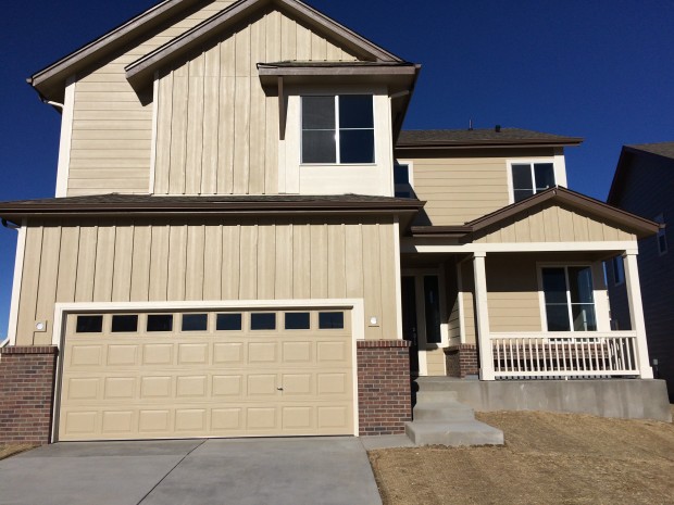 We still have to put a yard in, and I’m sure some green grass will make this house pop. I also need to find carriage lights for either side of the garage, and would love to do a fun front door color if our HOA allows it.
The Front Door/Entry
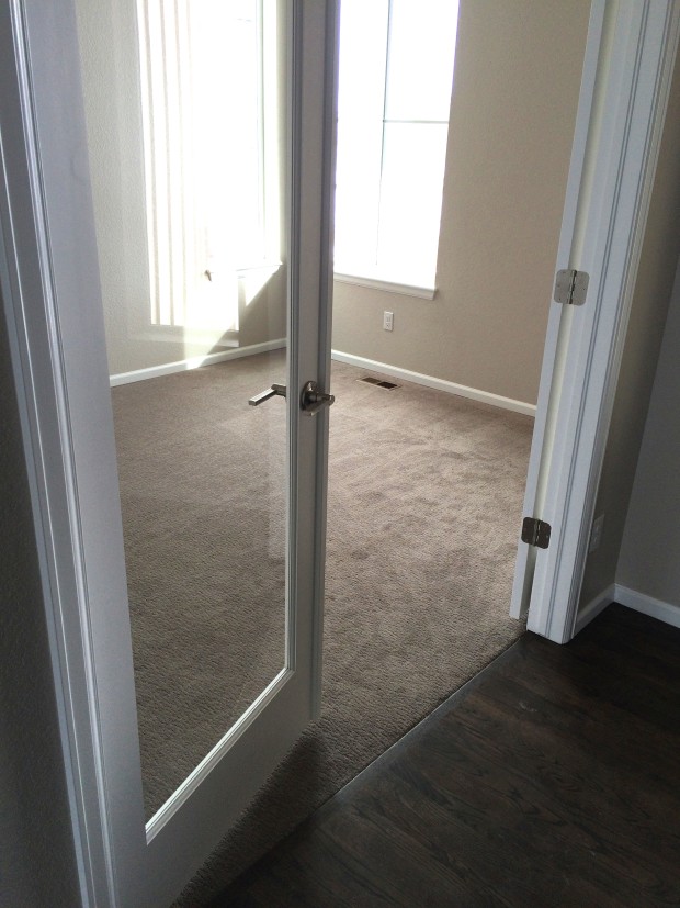 There are glass french doors leading to what is my husband’s office just to the right once you come in the front door. We’ve already gotten some bookshelves and storage in place, and we need to refinish a desk before it really looks like an office. He’s so happy to reclaim some “man” space in this house.
The Half Bath
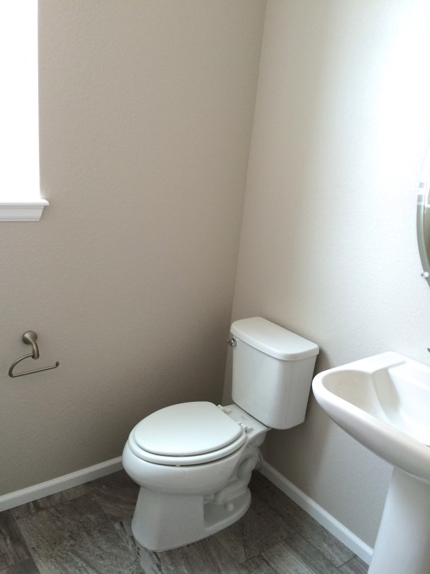 Nothing crazy here, just a toilet and sink, but I’m planning on a using some blue and white art and pops of kelly green in here to give it some color. I really want to DIY this thin ladder too.
The Kitchen
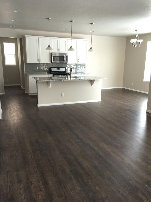
 Once I turned the corner of the entry and saw this kitchen I was pretty much sold. I love the clean white cabinets, the marble-esqe granite, and the blue-ish/green tile backsplash (which I pet frequently). We have since purchased a refrigerator and I plan to get some industrial/rustic bar stools. I also have a little coffee station set up for my husband. I don’t want to clutter the counters too much (even though they are in a state of disaster mid-move in), but adding some wooden cutting boards and containers will really warm the space up.
The Dining Room
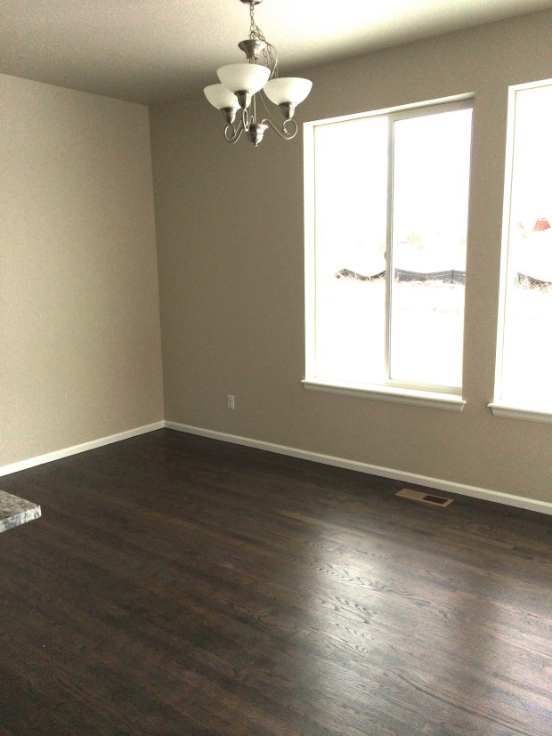 The lighting in this photo is pretty bad, but you can tell that our paint color is a true greige because it looks grey most of the time, but very beige in this photo. Other than plopping down our table, not much has happened here. I would love to change out the lighting fixture for a horizontal chandelier, like this.
The Living Room
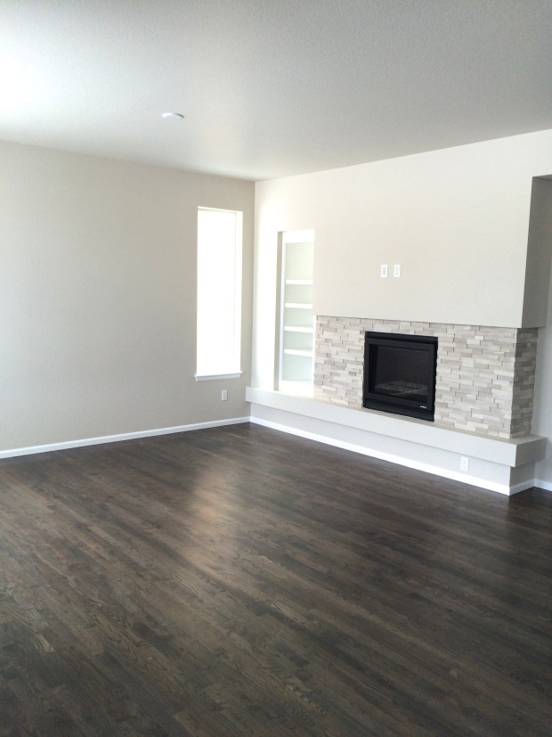 I love all of the crisp colors and cleanliness of the room. I especially love the color of the hardwood floors, not too dark, not too light, not oak colored, not red, they’re perfect. We’ve added our furniture, a new TV, and some accessories and it’s coming together. I have plans to put some large coastal charts on the walls but still need to get them framed. I also really want to add a chunky, reclaimed wood mantle. I think it will warm up the fireplace area #seewhatididthere, and add a little rustic to a somewhat modern fireplace design.
Here’s another view looking back toward the kitchen and dining area. This house is the definition of open floor plan.
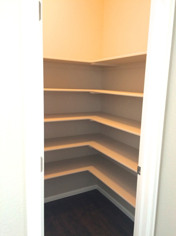 I’m so excited to have a dedicated pantry and love that there are solid shelves so nothing falls through. I’m thinking labeled containers and storing lots of serving ware and vases in here. Some of that I’ve already done.
The Laundry Room
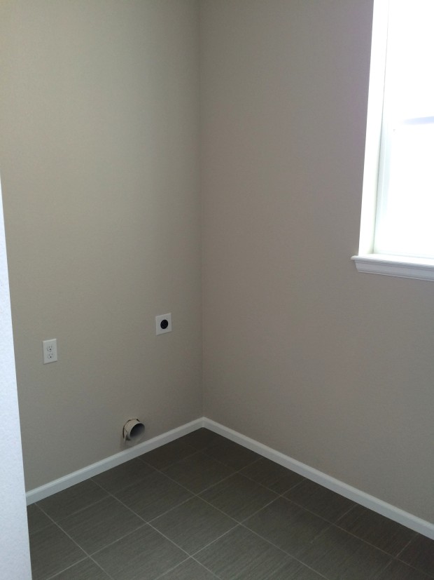 Since we first visited there have been cabinets installed which are great for storing away laundry and cleaning supplies. We also put our new washer and dryer in here and the gun metal grey color of them look great in here. It’s going to be so nice to have one central area for cleaning supplies, I’m hoping to organize them on a peg board.
Upstairs Nook
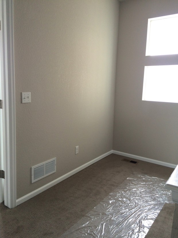 This is the landing at the top of the stairs that will be a great place for fun vignettes and seasonal decor.
Playroom/Upstairs Office
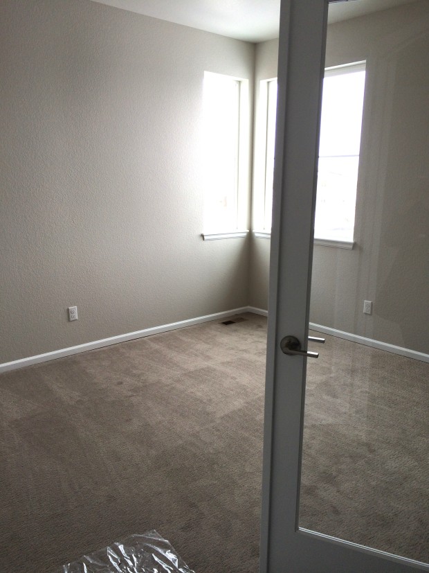 There is a loft space upstairs that we’ve turned into a shared playroom for my daughter and an office/craft space for me. I can already say that sharing a space with my daughter is fantastic. I can work while she does puzzles, reads, or makes a “snack” in her play kitchen. The only problem is figuring out the furniture placement, it’s proving to be a little difficult, or maybe I’m just not decisive enough. I’d love to have a really girly color scheme in here with pinks, teals, and florals. You can see what I’m thinking on my Color Scheme Pinterest board, and be sure to follow me on Pinterest to see all of my home inspiration boards.
Master Bedroom
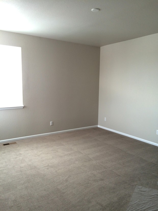 Our master bedroom is so much bigger than our last one, it’s almost a little weird to be able to walk around our bed without banging my knees into anything. We’re not doing anything too different than how our room was set up in our last house.
The Master Bathroom
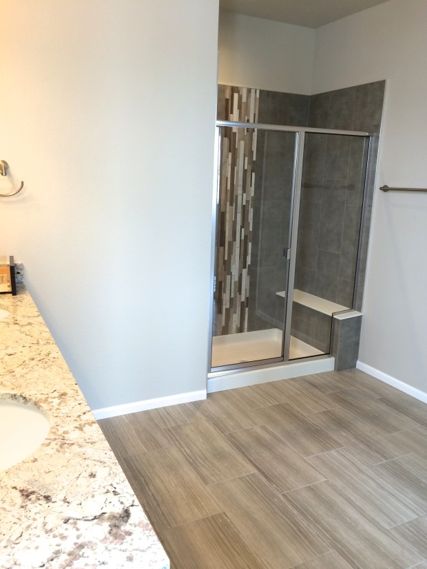 Our master bathroom is also huge! There is so much space that my husband is also getting a coffee bar in here too! He loves coffee! It’s nice that I’ll be able to be a little decorating in here too.
The Master Closet
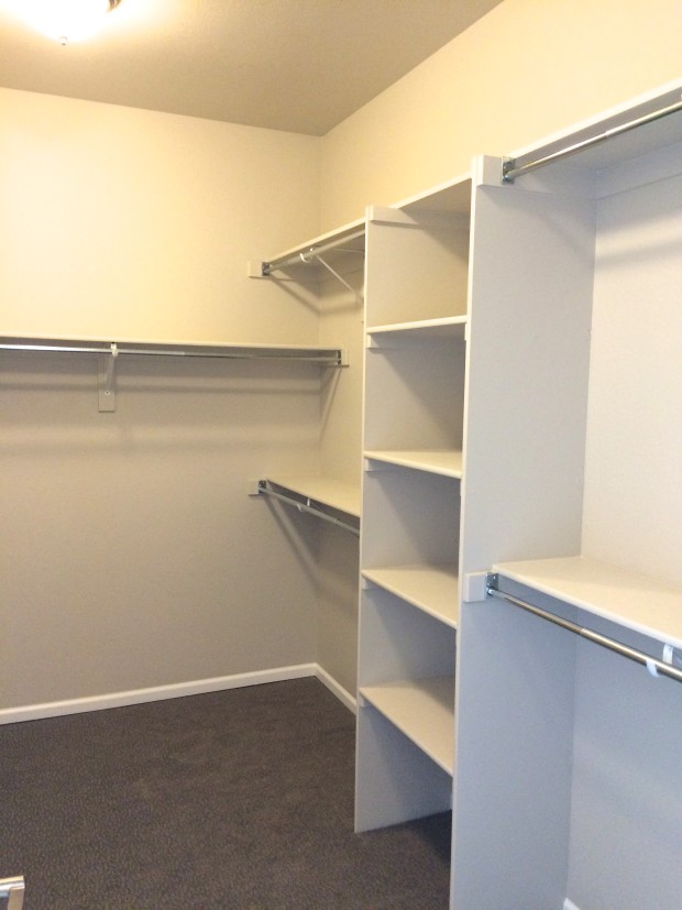 Everything in this house is just bigger than our last. Thank goodness we’ve got plenty of room for both mine and my husband’s clothes, shoes, and accessories. I’ve already added some storage for shoes and accessories, now I just need to make the space a little cuter.
Daughter’s Room
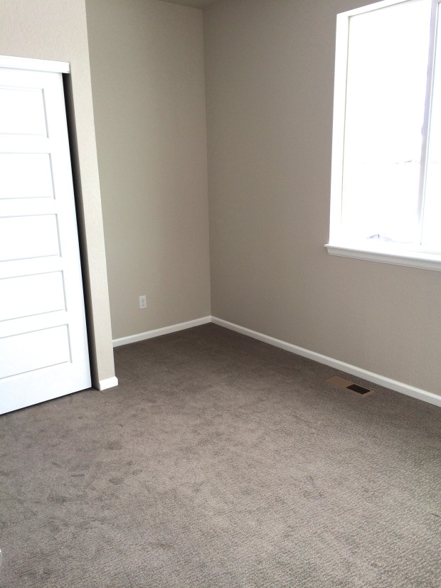
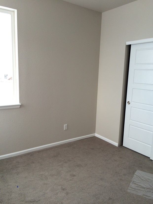 She will be getting an upgrade within the next few months to more of a little girls room than a nursery and it’s going to be a lot more girly. Think pink, gold, and creams!
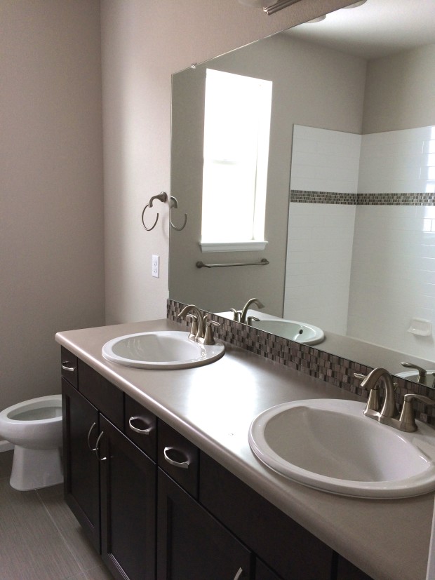
The Hall Bathroom
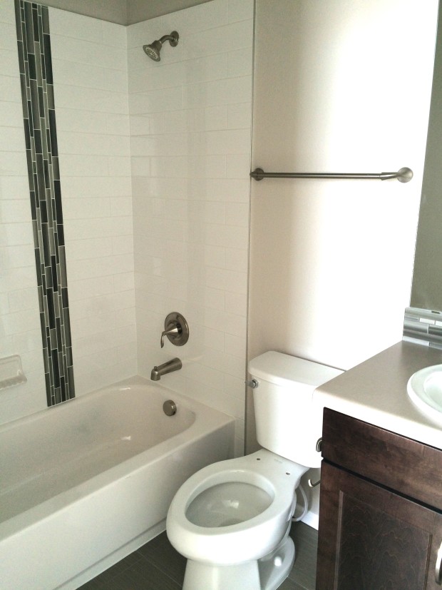 We have plenty of space for visitors which is nice since we’re so much closer to our family in Colorado than we were in Southern California.
Well, that’s pretty much every square inch of our house. I hope you like it as much as I do! We’ll be working hard over the next few weeks to get things more organized and decorated and as I make progress I’ll be sure to update the Home Tour.

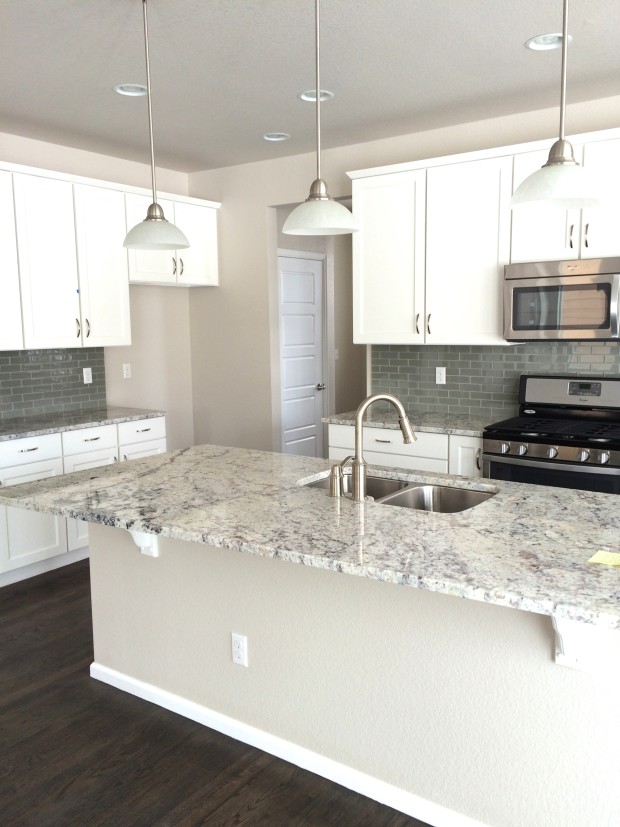
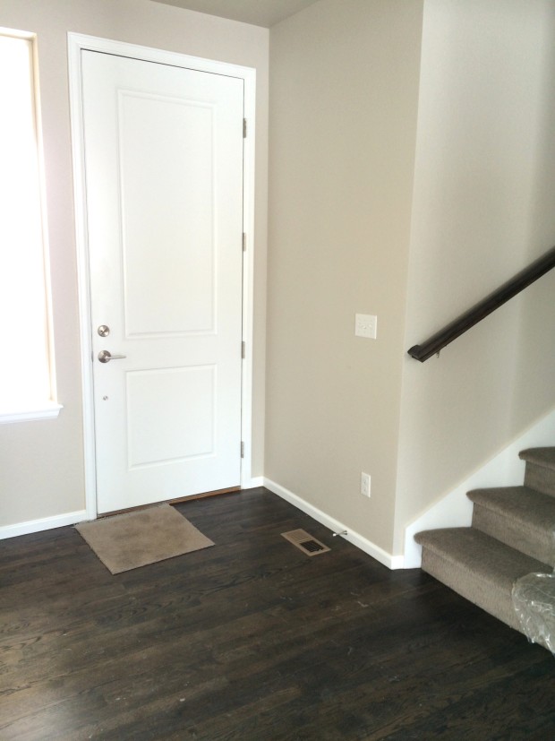




I just love how airy and clean everything looks. And that backsplash is my dream backsplash.
So jealous of the bench in your shower. Sometimes I just need to sit down while showering… Haha.
Thanks, I almost don’t feel the need to clean because of how airy and “clean” looking the house is, haha!